Blog posts with images receive 94% more views than those without. This statistic speaks volumes about visual content’s impact.
Many bloggers find it challenging to create professional-looking graphics. They believe they need expensive software or advanced design skills. You actually don’t need either of these to make your blog visually appealing.
Creating eye-catching blog graphics is easier than you might expect. Free tools like Canva blog templates and simple design principles can help you turn ordinary post graphics into attention-grabbing visuals that keep readers involved.
People are likely to remember 65% of the information paired with a relevant image three days later, compared to only 10% when presented with text alone.
Brain Rules
Want to enhance your blog’s visual appeal without spending money? Let’s explore how to create eye-catching blog graphics that capture attention and boost reader involvement.
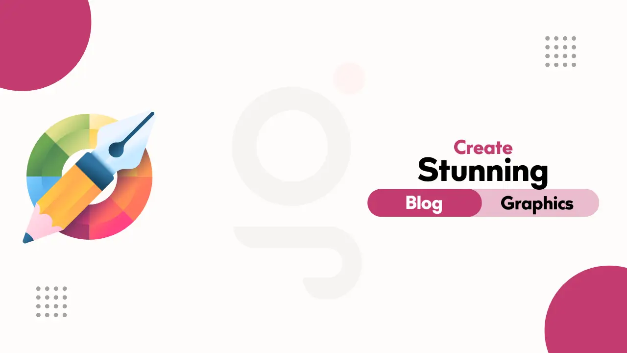
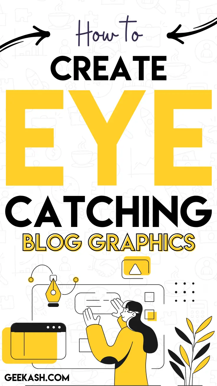
How to Create Eye-Catching Blog Graphics
Creating eye-catching blog graphics can seem daunting at first, but with some guidance and the right tools, it becomes an exciting part of your content creation process. The key is to focus on aspects that will appeal to your audience while reflecting your brand’s identity. From choosing the right color palette to selecting the perfect typography, every detail contributes to the visual impact of your graphics.
Basic Design Fundamentals
A solid grasp of design principles will help you create better blog graphics. These simple guidelines will help you craft visuals that look professional and deliver your message.
Color Theory Basics for Blog Graphics
Your blog graphics’ success largely depends on your color choices. Studies show people make subconscious judgments about content in 90 seconds, with 62-90% of that assessment based on color alone.
Different colors evoke specific emotional responses:
- Blue: Trust and confidence
- Green: Growth and health
- Red: Energy and urgency
- Orange: Excitement and positivity
- Purple: Creativity and luxury
- Black: Sophistication and power
Typography Principles That Convert
Typography does more than just look good – it ensures your message reaches your audience effectively. Web-based blog graphics typically work better with sans-serif fonts for readability.
These typography rules will help you create professional graphics:
- Use no more than two typefaces per design
- Maintain a minimum font size of 16px for readability
- Create a contrast between headings and body text
- Ensure sufficient spacing between lines
- Keep line length between 40-80 characters for optimal readability
Layout Rules for Visual Hierarchy
Visual hierarchy guides your readers’ eyes through blog graphics in a planned sequence. Research indicates that proper visual hierarchy can affect how users process information by a lot.
Contrast, size, and white space form the foundations of effective layouts. Important elements should stand out through larger sizes or contrasting colors. White space serves a purpose – it creates emphasis and makes designs easier to digest.
Your audience’s natural reading patterns should guide element arrangement in blog graphics. English-speaking audiences respond best to F-pattern or Z-pattern designs that line up with natural eye movement patterns.
Essential Design Elements
Professional blog graphics depend on mastering three key components that work together harmoniously. Here’s how you can apply each one successfully.
Choosing the Right Images
The perfect image for your blog graphics involves more than picking something attractive. Quality images that match your content greatly affect reader engagement. Your image selection should focus on these vital factors:
- Relevance to content and headline
- Image quality and resolution
- Copyright compliance and proper attribution
- Space for text overlays
- Brand consistency
- Visual impact and emotional appeal
Using images found through Google search can lead to legal issues. You should use free stock photo resources or purchase licensed images to comply with copyright laws.
Working with Text Overlays
Text overlays on images need careful handling but play a key role in creating engaging blog graphics. Research shows that text overlays can substantially affect readability with proper execution. These proven techniques make text overlays work:
- Use a scrim (semi-transparent gradient layer) with 40% opacity
- Apply color overlays to neutralize busy backgrounds
- Implement Gaussian blur for better text visibility
- Create contrast between text and background
- Ensure text meets accessibility standards with a minimum contrast ratio of 4.5:1
Using White Space Effectively
White space serves as a powerful design element that can increase reading comprehension by up to 20%. Your blog graphics should incorporate white space thoughtfully.
Good white space usage structures and organizes content while making it easier to read. Think of white space as breathing room for design elements. Too little creates clutter, while too much disconnects elements from each other.
The best results come from consistent spacing between elements and adequate text margins. This approach makes your graphics visually appealing and guides viewers’ eyes to important information naturally.
Balancing micro white space (between text and small elements) and macro white space (around major design components) creates a harmonious composition that readers can easily understand.
Selecting Free Design Tools
The right tools can make all the difference when you create stunning blog graphics. Here are the most useful free resources that will help you apply the design principles we discussed.
Top Free Graphic Design Platforms
Your blog post graphics can go from ordinary to extraordinary with these powerful free design platforms. Canva stands at the top with over a million templates, graphics, and photos available in its free plan. Adobe Express brings professional features with 25 AI credits monthly in its free version for users who prefer Adobe’s approach.
VistaCreate distinguishes itself through its vast library of over 70M royalty-free photos, videos, and vectors. Each platform brings something special:
- Canva: Best for template-based design with 5GB cloud storage
- Adobe Express: Ideal for scaling side hustles with 2GB storage
- VistaCreate: Perfect for accessing extensive design assets with 10GB storage
Must-Have Browser Extensions
These time-saving Chrome extensions will improve your design workflow significantly. Window Resizer helps you create responsive designs by adjusting your viewport to different screen sizes instantly. ColorPick Eyedropper lets you identify and capture any color you see online.
WhatFont and FontsNinja extensions identify typefaces instantly, showing font size, weight, and color information. These tools help maintain consistency in your blog graphics while making the process smoother.
Free Stock Photo Resources
Quality visuals are vital for creating eye-catching blog graphics, though finding the right images can be tricky. Several platforms give you access to extensive libraries of free, high-quality stock photos. Canva gives you access to over a million free images, while VistaCreate provides a vast collection of royalty-free media.
Note that you should always check usage rights and attribution requirements for free stock photos. Many platforms provide completely free images for commercial use, but reading the licensing terms carefully matters.
These free tools combined with our design principles will give you everything needed to create professional-looking blog graphics that grab attention and boost engagement. Try different platforms and find what works best for your creative style and workflow.
Finding Inspiration
When you’re seeking inspiration for your blog graphics, exploring a variety of sources can spark your creativity. Start by diving into Pinterest, a treasure trove of visual ideas where you can discover a plethora of color combinations, layout styles, and typography examples. Another great avenue is Instagram; not just a social platform, it’s a gallery of creativity where designers and bloggers share their innovative work—and you can too! As you scroll, remember to save posts that catch your eye for future reference.
Don’t ignore design blogs such as Awwwards and Smashing Magazine, which feature expertly crafted visual content. These sites showcase award-winning designs that can provide you with cutting-edge ideas and tips on the latest trends in graphic design.
Now, as you gather these inspirations, consider creating a mood board. This visual tool allows you to collect, organize, and view your ideas in one place. Use platforms like Pinterest or Canva to create secret boards, pinning everything that speaks to your creative vision. By accumulating a collection of designs you love, you’ll start to notice patterns and preferences—guiding your own unique graphic creations.
Creating Your First Graphic
You’ve picked your design tools, and now it’s time to create your first blog graphic. Let’s turn your ideas into eye-catching designs that grab attention and boost reader participation.
Setting Up Your Canvas
Your first step is picking the perfect template that fits your blog’s look and topic. Platforms like Canva give you blog post graphics templates in various styles – illustrated, monochromatic, retro-inspired, or minimalist designs. Here’s how to set up your canvas:
- Select your template size (recommended: 1200px width for the content area)
- Pick a template that lines up with your brand
- Configure your workspace with proper margins
- Set up your color palette and typography
- Save your template to use later
Adding Visual Elements
Each visual element on your canvas should work together to tell your story. Start with a catchy headline and add visual elements that support your message. These components make a significant difference:
- Stand-out typography for headlines
- Appropriate illustrations and stickers
- Color schemes that match your brand
- White space for better readability
- High-contrast combinations for easy viewing
Your graphics need consistency. Readers should recognize them as part of your brand right away, which creates a unified visual experience in all your blog posts.
Applying Design Principles
A simple design becomes a masterpiece when you apply fundamental design principles. Create a visual hierarchy through size differences and keep proper alignment to achieve a professional look.
Consistency plays a vital role in successful design. A winning template becomes the foundation for future graphics. This approach saves time and makes your brand more recognizable.
High-contrast combinations catch the eye and are easier to read. Text overlays need enough contrast with their background so everyone can read them easily.
These proven design strategies will help you create maximum impact:
- Use size to guide your reader’s eye to important information
- Stick to one alignment style per graphic
- Leave sufficient breathing space around elements
- Limit information to 5-6 different types per graphic
Pro tip: Your background gets more depth with a subtle gradient. This simple technique turns a plain color background into something visually interesting without overwhelming your content.
Creating Blog Graphics with Canva
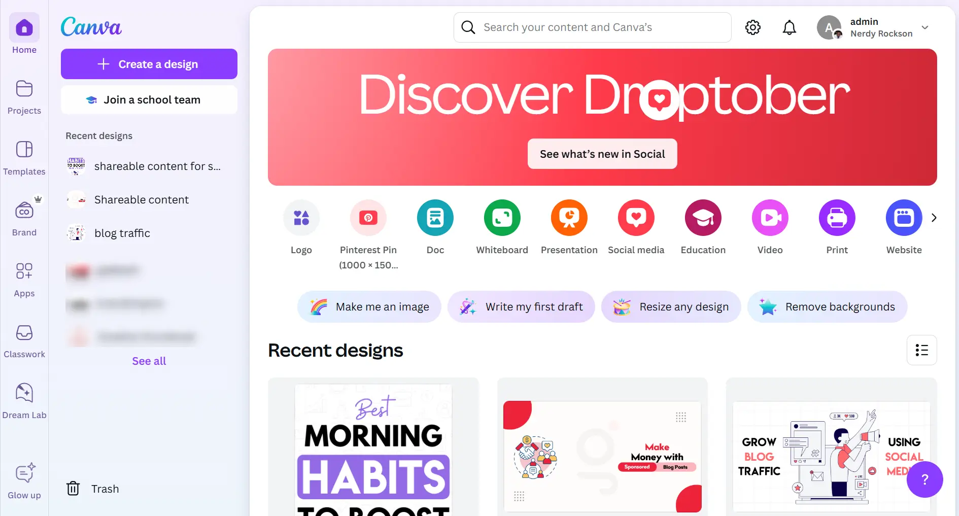
To craft your blog graphics, let’s delve into using Canva, a popular and user-friendly tool. Follow these steps to create stunning visuals effortlessly:
- Sign Up and Log In: Begin by visiting Canva’s website. Sign up using your email or log in if you already have an account.
- Select a Template: Once logged in, you’ll be greeted with a variety of design templates. For this guide, select the “Blog Banner” template from the homepage. Canva offers a plethora of free templates to get you started.
- Customize Your Design: To make the graphic truly yours, click the “Text” option to add a catchy title or content. Canva lets you choose from numerous fonts, so feel free to experiment!
- Add Images and Elements: Click on “Elements” to explore icons, shapes, and lines. Canva’s “Photos” tab grants access to an extensive library of free images. Drag and drop elements to enrich your design.
- Incorporate Branding: To maintain consistency, incorporate your brand’s colors by clicking on the color palette. This is where you can apply your brand’s color codes to elements in your design.
- Review and Adjust: Before wrapping up, give your design a thorough look to ensure everything aligns. Use the “Align” feature for the perfect placement of elements and text.
- Download Your Graphic: Happy with the result? Click the “Share” button at the top right, then select “Download”. Choose your preferred format—JPEG is excellent for web use—and download your new blog graphic.
Voila! You now have a professional and eye-catching blog graphic ready to enrich your posts. With practice, creating stunning visuals becomes second nature. Dive into Canva and unleash your creativity!
Optimizing Graphics for Web
Blog graphics need proper optimization to look great and keep your website running smoothly. Images make up 42% of a typical web page’s total weight, so optimization becomes vital to your blog’s success.
Image Size and Resolution Guide
The right size of blog graphics matters for web display. Your images should match your blog content width – no larger. To cite an instance, a 690-pixel-wide blog content area doesn’t need larger images that will scale down anyway.
Graphics for the web need these specifications:
- Desktop webpage dimensions range from 1024 x 768 px to 1920 x 1080 px
- Mobile dimensions range between 360 x 640 px and 414 x 896 px
- Web displays don’t need PPI (pixels per inch) or DPI (dots per inch)
File Format Selection
Your choice of file format affects quality and loading speed by a lot. Here’s what each format offers:
- JPEG (JPG)
- Works best with photographs and complex images
- Handles a wide range of colors
- Creates smaller files through compression
- Can’t handle transparency
- PNG
- Perfect for logos and graphics with text
- Handles transparency well
- Comes in PNG-8 (256 colors) and PNG-24 (millions of colors)
- Files are bigger than JPEG
- WebP
- Google’s format for efficient web use
- Supports both lossy and lossless compression
- Creates smaller files than JPEG with similar quality
- Handles transparency and animation
Compression Techniques
Quality compression helps your pages load faster without looking bad. Google pushes sites with slow loading times down in search rankings, making smart compression a key to success.
Best compression practices include:
- JPEG images work best at 80% quality
- Edit your original photo before any scaling or compression
- Use the smallest size that matches your display needs
- Automated compression tools help with batch processing
Different image types respond differently to compression. Photos work well with lossy compression (like JPEG) to reduce file size while looking good. Graphics with text or sharp edges need lossless compression (like PNG) to stay clear.
Pro Tips for Optimization:
- Avoid scaling images up after making them small – this causes pixelation
- HTML img tags need either width or height specified – not both – to keep proper ratios
- SEO benefits from relevant image file names
- Lazy loading helps with images below the fold
- CDNs (Content Delivery Networks) deliver images faster
These optimization techniques will make your blog graphics look professional while keeping your site fast. The sweet spot between image quality and file size creates an engaging experience that brings visitors back.
Conclusion
You don’t need expensive software or professional design skills to create eye-catching blog graphics. A solid grasp of design fundamentals, simple elements, and free tools will help you turn simple visuals into attention-grabbing graphics that boost your blog’s appeal and increase participation.
Your blog’s success depends on applying the right design principles, choosing suitable visual elements, and optimizing graphics for web performance. A consistent design approach matters while you try different templates and tools to develop your unique style.
Take small steps and master one principle at a time. Your blog graphics will capture readers’ attention and generate meaningful participation as you practice these techniques consistently.